

Beyond Black And White: Color Is Becoming A New Product Language For Digital Pianos After Music China 2026
Nov 02, 2026
Leave a message
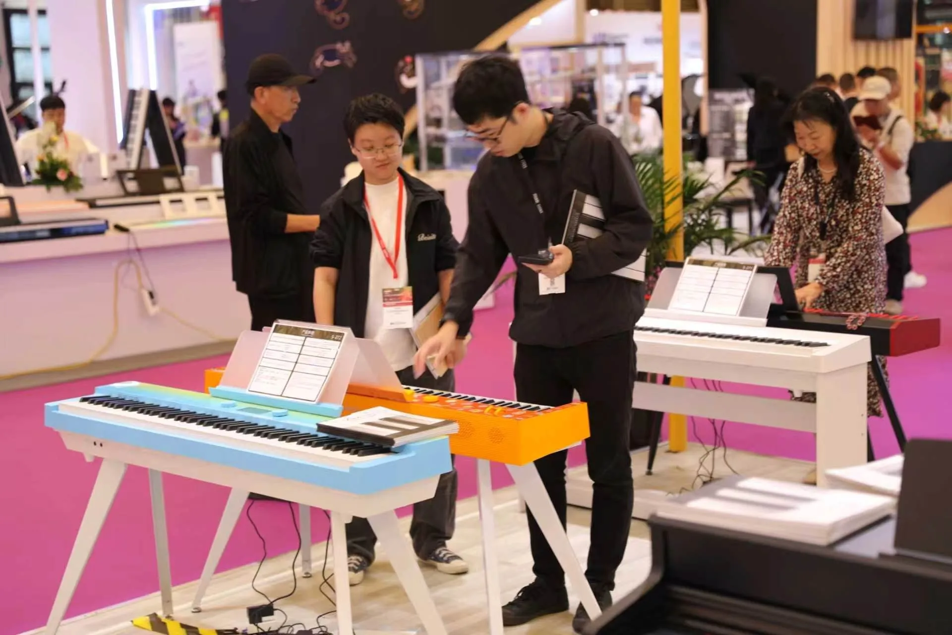
Music China 2026 has ended, leaving the electronic keyboard and digital piano industry with many technical topics to consider. Yet at Beisite's E1D46 booth, the first thing that made many visitors stop was not a specification card. It was color. Blue, orange, white, red and furniture-inspired wood-grain finishes turned products that might otherwise look similar into objects with distinct personalities.
This does not mean buyers have stopped caring about key action, sound source, speakers or connectivity. The real change is that appearance now enters the decision much earlier. A customer first asks whether an instrument belongs in a living room, studio or commercial space, and only then compares its playing experience and functions. For manufacturers and distributors, color is no longer a final coating choice. It has become part of positioning, inventory planning, merchandising and brand recognition.
What the Show Floor Revealed: The Piano Is Becoming a Spatial Product
Music China 2026 took place from October 28 to 31 at the Shanghai New International Expo Centre. Published coverage reported approximately 120,000 square meters of exhibition space across 12 indoor halls and one outdoor hall, with more than 1,500 companies from 31 countries and regions presenting instruments, music technology and related services. In such a dense environment, visual differences between products became more obvious than they appear on individual web pages.
At Booth E1D46, cabinet digital pianos, portable keyboards and colorful instruments were displayed in one space. Conversations revealed an interesting pattern. Professional buyers continued to ask about keyboard mechanisms, ports and sound sources, while many visitors first asked about colors, room placement and alternative finish options. Appearance did not replace performance, but it became the doorway into the discussion.
This helps explain why search terms such as "home digital piano," "white digital piano," "wood-grain digital piano" and "colorful electronic keyboard" deserve a place in product content. Customers are not searching only for an instrument. They are looking for a long-term object that works with walls, flooring, lighting and furniture. For retailers, displaying one model in several finishes can communicate different lifestyle scenarios rather than merely adding more SKUs.
A digital piano now competes on two levels. It must satisfy the player when it is heard and touched, but it must also satisfy the household or business when it is viewed every day. This broader role explains why product teams increasingly need input from interior designers, retail merchandisers, photographers and logistics specialists-not only musicians and engineers.
Color Is Not Only Aesthetic; It Changes Channel Selection
Black remains the safest and most familiar choice in the digital piano market. It resembles the visual language of an acoustic piano and works in schools, studios and most homes. White fits modern, light-wood and bright commercial interiors. Wood-grain finishes emphasize a furniture character and appeal to users who want less of an electronic-device appearance. Painted high-gloss surfaces create stronger showroom impact, but they also demand more careful protection, cleaning and surface inspection.
Colorful instruments serve a different purpose. They can suit children's music spaces, content production, pop-up events, co-branding projects or stores seeking social-media visibility. Blue and orange instruments at the show drew cameras quickly, something a conventional black model may not achieve as easily. However, the brighter the color, the more carefully a distributor must understand local taste. A finish that looks striking in a short video is not automatically suitable for high-volume inventory.
A more practical approach is to divide finishes into core, regional and project-specific options. Core finishes remain continuously available. Regional finishes respond to distributor and market feedback. Project finishes serve schools, hotels, commercial spaces, education brands or event partnerships. This structure preserves visual innovation while reducing inventory pressure caused by inaccurate color forecasting.
Channel strategy also matters. An online seller may benefit from a distinctive finish that performs well in thumbnails, while a traditional showroom may need colors that remain easy to coordinate with the rest of its display. A contract buyer for a hotel or education chain may care more about batch consistency and replacement availability than visual novelty. The same color therefore carries different commercial value across different channels.
B-81 and B-82: Two Product Strategies within One Visual Language
Product information for the Beisite B-81 and B-82 lists wood grain, painted finish, black and white options. Both models also use an 88-key graded weighted piano keyboard and a French Dream sound source. They therefore share a visual and fundamental playing language, while their feature levels and intended applications differ.
The B-81 includes audio output, dual headphone connections, sustain-pedal and three-pedal options, and USB-MIDI. Optional features include Bluetooth audio, Bluetooth MIDI and mini-app functions. Its listed dimensions are 138 × 48 × 85 cm, with a net weight of 55 kg and two rated 25 W speakers. Its product logic is that of a visually complete cabinet digital piano with focused functions for homes and general institutional environments.
The B-82 further lists 1,211 voices, 200 rhythms and 349 demonstration songs, together with audio input and output, dual headphone connections, three pedals and USB-MIDI. Its feature list also includes accompaniment controls, recording, twin keyboard, dual voice, touch response, reverb, chorus, harmony, four memory banks and an MP3 playback system. Its listed dimensions are 138 × 48 × 95 cm, with a net weight of 60 kg and two rated 40 W speakers. Compared with the B-81, it is positioned for scenarios requiring richer accompaniment, demonstration and interactive functions.
These specifications do not prove that more features are always better. They show that finish options must be planned together with product level. If a distributor focuses only on color while ignoring whether users need basic practice, home entertainment or accompaniment demonstrations, product-market mismatch can still occur.
A channel can therefore use a finish matrix together with a feature matrix. The same white or wood-grain finish might be applied to a focused home-practice model and to a feature-rich entertainment model, but the product page, target audience and showroom explanation should remain different. Visual consistency does not mean commercial positioning must be identical.
Appearance Customization Is Really a Test of Production Consistency
From a manufacturing perspective, adding a color is not simply a matter of changing paint. Wood-grain laminates, matte surfaces and painted finishes involve different controls for color variation, gloss, scratch resistance, packaging protection and inspection. A sample that looks attractive under exhibition lighting is only the first step. Long-term commercial confidence depends on consistency across production batches.
Color naming also needs standardization. "Cream white," "warm white" and "ivory white" may sound similar, yet look very different in production. OEM and ODM projects should not approve finishes using only messaging-app photos. They need color codes, material samples, defined lighting conditions and signed approval records. Painted products should also be inspected for orange peel, dust particles, scratches and edge coverage.
Packaging changes with the finish as well. High-gloss surfaces require stronger protective film and separation materials, while dark gloss makes minor scratches more visible. Light-colored products need packaging materials that will not transfer color. With listed net weights of 55 kg and 60 kg, and substantial product and carton dimensions, the B-81 and B-82 require finish validation together with handling paths, cushioning and unboxing procedures.
Production teams should also define what degree of variation is acceptable. Natural wood-grain patterns may vary by panel, while painted surfaces should normally meet a much tighter visual standard. Approval criteria need to match the material instead of applying one rule to every finish. Clear standards reduce arguments between factories, importers and retailers after shipment.
Retail Display Should Move from Rows of Pianos to Designed Scenarios
Traditional music stores often place multiple black digital pianos in orderly rows, making price and feature comparison easy but also making products look similar. Color and furniture-inspired models create new merchandising possibilities. A white piano can sit with light wood and natural lighting. A wood-grain piano can define a study or living-room setting. Bright colors can enter children's areas, content corners or event zones.
Scenario-based merchandising does not require a major renovation. Wall-color samples, rugs, lighting and a small amount of furniture can help customers imagine the instrument in a real room. More importantly, product cards should evolve. Alongside key count, voices and ports, they can show suitable interior styles, installed dimensions, carton dimensions and delivery guidance.
The same approach can improve online sales. A distributor can create "modern white living room," "warm wood-grain study" and "black professional studio" content for one model instead of repeatedly posting a specification sheet. Google Search and image search can better understand specific scenarios, and users can find pages that match their actual needs.
Retailers can also use finish options to organize trials. Instead of asking only, "Which model do you want to hear?" a salesperson can ask where the piano will be placed, what other furniture is nearby and whether the buyer prefers the instrument to blend in or stand out. These questions make the conversation more practical without distracting from touch and sound.
A Colorful Instrument Must Do More Than Look Good in Photos
Color creates immediate appeal, but a digital piano must withstand years of touching, cleaning, moving and exposure to light. Before approving a finish, teams should consider fingerprint visibility, compatibility with common cleaning products, dust accumulation near the keyboard and whether separate parts may age at different rates.
Distributors also need to describe color carefully. Cameras, lighting, displays and post-processing all affect the image. An orange finish on a web page may not perfectly match the physical product. Product pages should note that slight variation may occur and should provide natural-light, indoor-light and close-up images whenever possible. For volume projects, a physical sample remains more reliable than a screen color.
The range of colors shown by Beisite at Music China 2026 sent a clear signal: the design language of the digital piano is expanding. The next step is not to add unlimited colors. It is to develop a finish system that can sell consistently, remain stable in production and genuinely belong in its target environment.
Long-term usability also affects brand perception. A finish that photographs beautifully on launch day but scratches easily, discolors under light or is difficult to repair may create more dissatisfaction than a simpler, more durable option. Finish development should therefore include practical cleaning, abrasion, packaging and aging checks appropriate to the intended market.
Advice for OEM and ODM Buyers: Define the Space Before the Color
Before requesting a color, buyers should define where the instrument will be used. Living rooms, teaching studios, hotel lobbies, music restaurants, children's spaces and backstage areas have different expectations for appearance, durability and cleaning. Color becomes commercially meaningful only after the space and user have been defined.
The second step is to define the product level. Although the B-81 and B-82 share several finish options and an 88-key graded weighted keyboard, they differ in feature complexity, speaker configuration, size and weight. A basic home-practice project may not require the B-82's full accompaniment system. A channel focused on demonstrations, entertainment or interaction may value its expanded voices, rhythms and memory functions.
The third step is to control the first order. A new color can begin with exhibition samples, retail testing or targeted content before volume expansion. Evaluation should not rely on likes alone. Teams should track inquiries, trials, orders, returns and repeat orders. The commercial value of color must ultimately appear in sustainable sales, not only exhibition attention.
Buyers should also confirm whether the chosen finish will remain available for replenishment. A project may need replacement units months or years later. If a color depends on a temporary material or an unrepeatable coating process, future units may not match. A practical finish program therefore includes sample retention, supplier records and clear change-notification procedures.
Conclusion: The Next Memorable Digital Piano May Be Recognized by Color First
Music China 2026 demonstrated continuing changes in electronic instruments, digital audio and intelligent applications. It also made a more visible trend clear: the digital piano is moving beyond the image of a single black device and entering a wider range of home, education and commercial spaces. Color does not replace technology. It is the interface that brings technology into real life.
For a digital piano manufacturer such as Beisite, the wood-grain, painted, black and white options of the B-81 and B-82 are only one part of the finish system. Real competitiveness comes from coordinating visual design, playing configuration, production consistency, packaging delivery and channel content. A color that stops visitors at an exhibition becomes lasting product value only when all these elements work together.
The broader lesson is simple. A digital piano can no longer be developed as an isolated electronic product. It must be considered as an instrument, a piece of furniture, a retail object and a logistics unit at the same time. When those roles are aligned, color becomes more than decoration. It becomes a useful part of product strategy.